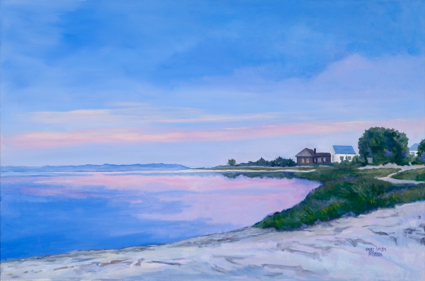
“Twilight at the Point” by Casey Chalem Anderson ********hand signed prints now available
Color is more than just an aesthetic choice—it has the power to influence emotions, ease anxiety, and enhance well-being. In my seascape paintings, I intentionally use blues, greens, lavenders, and soft pinks not just to capture the beauty of the sea, but to create a sense of calm and restoration for those who experience my work.
According to Your Brain on Art by Susan Magsamen and Ivy Ross, colors engage our nervous system in profound ways. Cool blues and greens, reminiscent of water and sky, have been shown to lower heart rate and reduce stress. These hues mirror nature’s calming effect, helping to quiet the mind much like a walk along the shoreline. Lavender, often associated with tranquility, carries a soothing presence, while soft pinks introduce warmth and a gentle sense of optimism. Together, these colors create a visual retreat—an invitation to breathe deeper, slow down, and feel at ease.
Art has the ability to shape our environment and, in turn, our mental state. Whether through a seascape that recalls the peaceful rhythm of gentle waves lapping or an abstract composition that invites personal reflection, my paintings are designed to offer a moment of serenity in a busy world.
If you’ve ever found yourself drawn to the water for solace, imagine bringing that same feeling into your home through art. What colors bring you the most peace? Let’s start a conversation, I’d love to hear your thoughts ✨
All the very best,
Casey
*****high quality full color prints on Hahnemuhle paper and hand signed. Priced from 185.00- up depending on size needed